In my recent post about the TransLink Trip Diary data release, I talked about how the use of cars in New Westminster is going down. Even as our population grows, the number of people using cars to get around is stable, and the actual number of car trips generated by New West residents on the average day is going down.
I also wrote this does not mean there are fewer cars on the road, or that traffic is getting better, because New Westminster is in the centre of a connected region, and that region is growing. Unfortunately, New Westminster’s decrease in car use is not being seen across the region, and our roads and livability are being impacted by those trips generated mostly from the south and east of us.
All but three municipalities in the Trip Diary data had an increase in car trips, and the combined number of regional trip increased by more than half a million trips a day between 2011 and 2017. This is only slightly offset by the combined decrease in trips seen in New West, West Van and White Rock: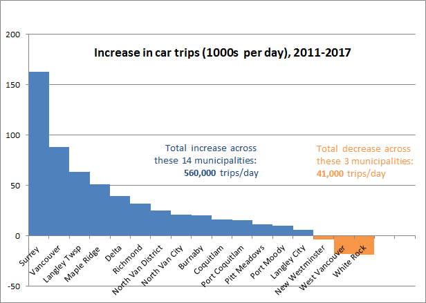
There are a couple of other ways to look at this data, using percentages instead of raw numbers. If there are 520,000 new car trips across the region, this pie shows the percentage of that total traffic load that is generated by each municipality: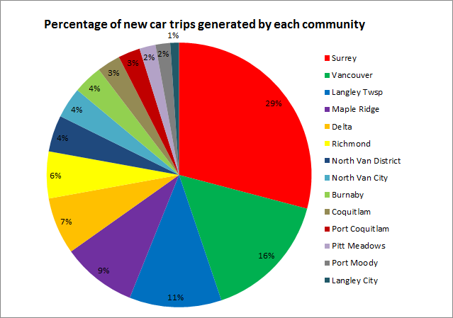
So no surprise Surrey and Vancouver lead the way in new car trips, as they are the largest municipalities, nor is it surprising that 50% of the new trips are generated South of the Fraser, and most trips are generated in areas where the region has spent billions of dollars building new freeway infrastructure and new river crossings.
But what about population growth? The South of Fraser an northeast communities are growing fastest, so it makes sense that their car trips will increase in correlation with this, right? More people = more trips is the meme I challenged last post, and it clearly is not the case for New West, but how true is that across the region? The blue bars here represent the percentage increase in car tips between 2011 and 2017, and the red bars represent the population increases over the same time period (2011 – 2017) from the BC Government stats page: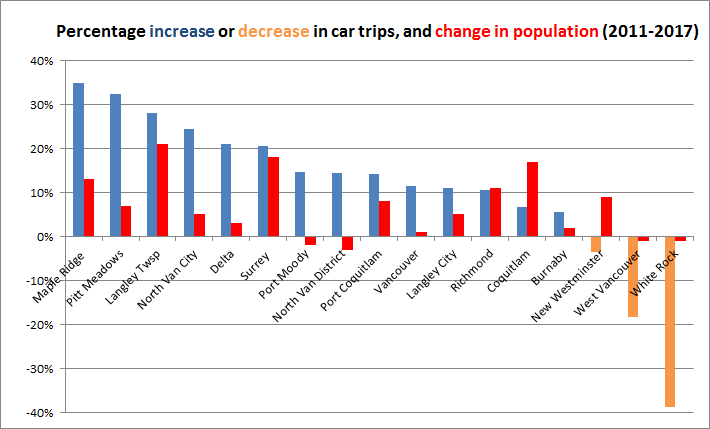
Note that in almost every municipality, car trip numbers are increasing at a faster rate than population. In Port Moody and North Vancouver District – two communities where the councils are using increased traffic congestion as a reason to slow or halt new housing – actual population did not significantly increase over that 6-year period (the fact they show a slight decrease in population is quirk in how BC Population stats are estimated between census years), yet this did not prevent car trips increasing. The short point:
Car trips and resultant congestion do not correlate with local population changes.
I leave you to speculate about what is happening in White Rock and West Vancouver, two municipalities where population has been stagnant or decreasing for a decade, and neither specifically transit-oriented relative to those of us sprinkled along the Rapid Transit spines, but both seeing much reduced car use. Each has its own tale to tell as West Vancouver had a significant increases in walking and transit use to balance out to about the same number of total trips, while the entire trip count for White Rock across all modes went down significantly. This graph shows the percentage increase or decease in each mode for all Cities, and you can’t help but wonder what people in White Rock are doing at home all the time: 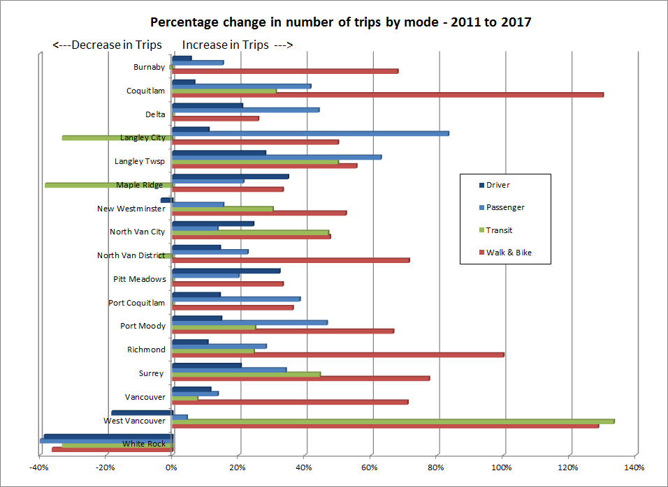
Also note the latest data was collected not long after the opening of the Evergreen Line, but before the changes that have come with the Mayor’s 10-year Plan investments, which has brought more and more reliable bus service across the region, both in undeserved and overcrowded areas. It is also worth noting that the 2011 data was before the opening of the expanded Port Mann Bridge, and the 2017 data was from the very time when tolls on that bridge were being removed, so the longer term impact on transportation patterns related to toll removal are muted here. Like all surveys, this represents a snapshot in time, and only by collecting this type of data over a longer period can we see the long-term trends our transportation policy is creating.